For the task at hand I was to create essential components of a music magazine. That would include my own images and I would piece together using Adobe Photoshop. I created a front cover, contents page and double page spread. I had to identify my demographic which was young music lovers aged 16-25 and further my niche audiences. The mature over 20’s that appreciate the music but like the magazine as a whole. And the under 20 teens who like the magazine, but will probably only buy this magazine for the person included within. Also to set aside the small audience that is comprised of the females that have an attraction to the artist who will be coaxed by the free poster revealed by the primary puff. The secondary puff would also interest all fans of the artist regardless of age because it is a promotion for tickets to see him live.
I began the front cover by analysing three alternative rock magazines. Alternative Press, NME and Q magazine. I wanted to convey the similar conventions of these magazines into mine in which I used a singular simplistic main image of the “rock star” that is featured inside the magazine which was inspired by Q magazine. I also wanted to use a big eye catching headline of the band/artist in question which meant the deck was two lines. The ideology behind this is that the artist used “Benadict Magnason” didn’t require a whole lot to entice the reader to buy the magazine. The simplistic rider wasn’t giving much away but as the star is supposed to be so well known it is all that is required.
The mast head used doesn’t contain a capital letter at the front for the reason that this magazine is not supposed to symbolize the start of something new. It is a magazine that has been around for a while and has become a way of life for its readers. The masthead is to be recognisable and become a brand logo in itself.
I used a quote underneath the main image as a strapline to further give incentive to buy and read for the audience. The use of reference to Scarface would be popular amongst the target audience. Because the music is intended to be masculine it is likely the target audience will have also seen the masculine movie Scarface. This intertextuality is therefore aimed at the male readers foremost.
The contents page has the main image of the artist yet again to further his involvement and importance within the magazine. The page number is accompanied by a caption much like the other features to give brief information about the content. The colours reflect the colour scheme of the front page for consistency reasons and so that the burgundy on murky yellow would then be recognised as ‘generation’ colours. Much like the white ‘Q’ in the red square. This contents also include yet another puff showing synergy of the magazine and a separate music based product known as iTunes. Which is clearly represented via the Apple Logo or Ident. This cross promotion further rewards the buyer for the purchase by giving them something that they can really use. The actual contents themselves are very cliché for a magazine, as they are misleading and evasive in terms of what they actually explain. This is another device placed to interest the reader further as the captions are open to interpretation and many connotations can be derived. The layout overall uses a lot of square sharp edges for a more masculine look to reflect the edgy harsh style of the music it is representing.
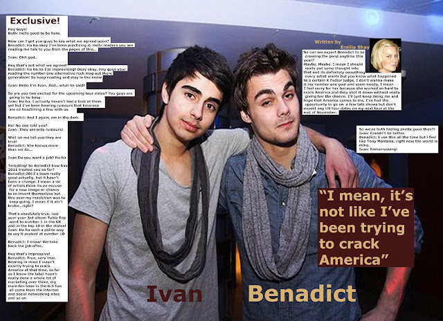
The double page spread main image was to be co-ordinated. The two people wear to echo each other as they are portrayed as brothers. Their costumes were selected keeping in mind of the colour scheme in the building so that nothing was standing. Also their positioning would be so that the centre fold would cut in between them and not through one of their faces etc. The reason I did not want anything to stand out was so that the pull quote was dominant. The next thing they would notice would be their faces as they stand out against the blue and gray because of their dark complexion. Although Myself and the other are not brothers I selected him because we have similar features and the story of us being siblings is plausible. The use of a by-line and photo image of the writer enforces a sense of professionalism and stature to the article. It is in my opinion that giving a face to the writer gives her a sense of credibility and prevents the idea that the magazine has mediated the true events of the interview. The over all layout of the text prevents the image being overlapped and therefore the option of using the whole page as a poster if that is the wish of the audience.
In summary I have used various codes and conventions that I believe mimic other magazines of this style. An alternative rock magazine is usually male dominated for a male audience which is what I have attempted to convey. Through the use of masculine colour schemes and edgy shapes. However the use of male “rock stars” does entice women into purchasing these types of magazine so that is also what I have followed. I wanted the institution of the magazine to be recognised as a successful and sought after label. I feel the over all look of the magazine and colour scheme give it its own distinct identity.


